The process involved extensive research into consumer preferences, iterative design phases, and the integration of feedback to ensure the brand resonates with its target audience and stands out in the market
This project focuses on creating a visually compelling and user-friendly branding experience for the beverage "PureSip," targeting modern, health-conscious consumers
Brand
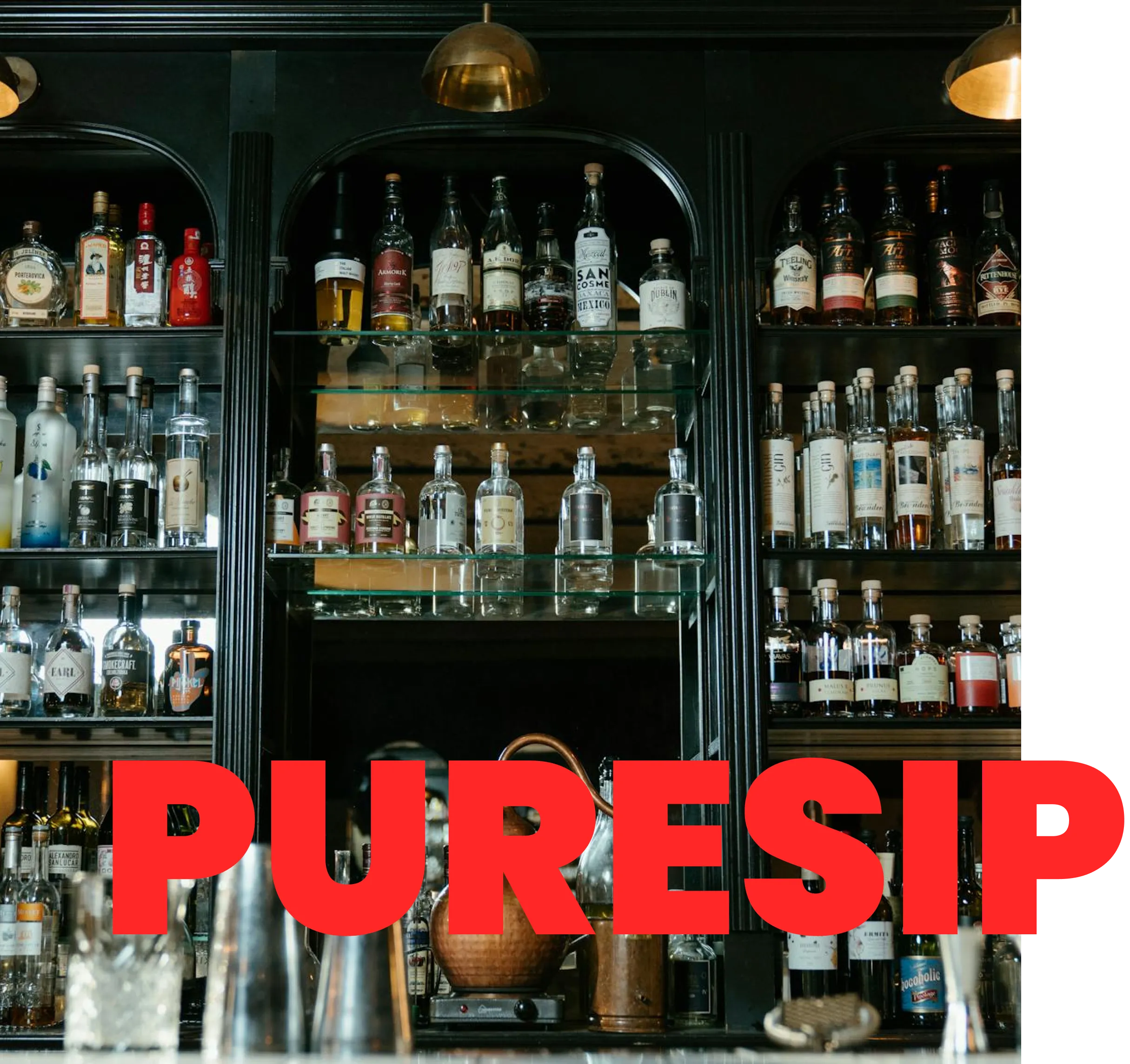
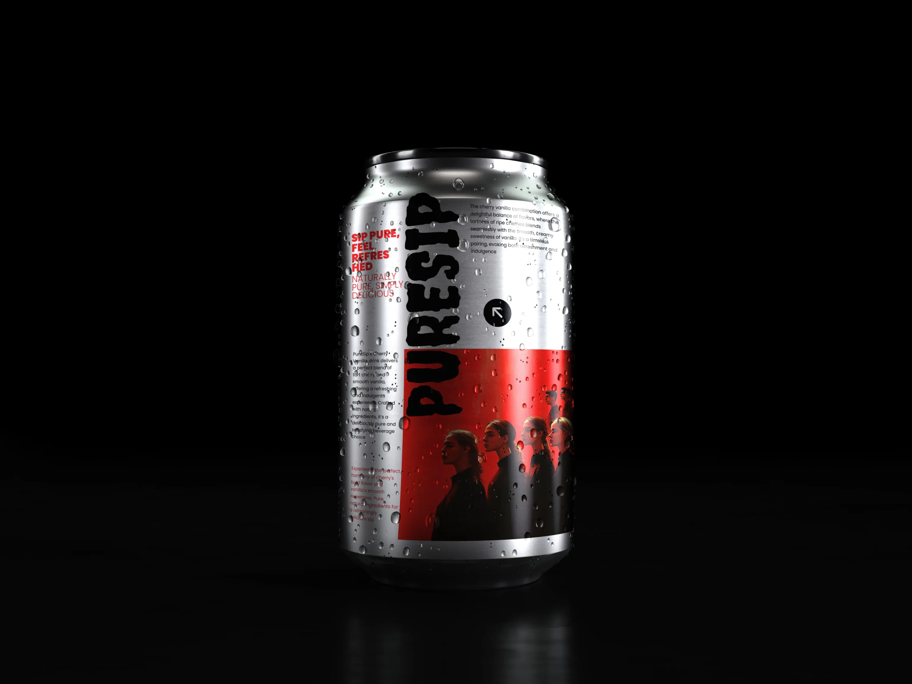
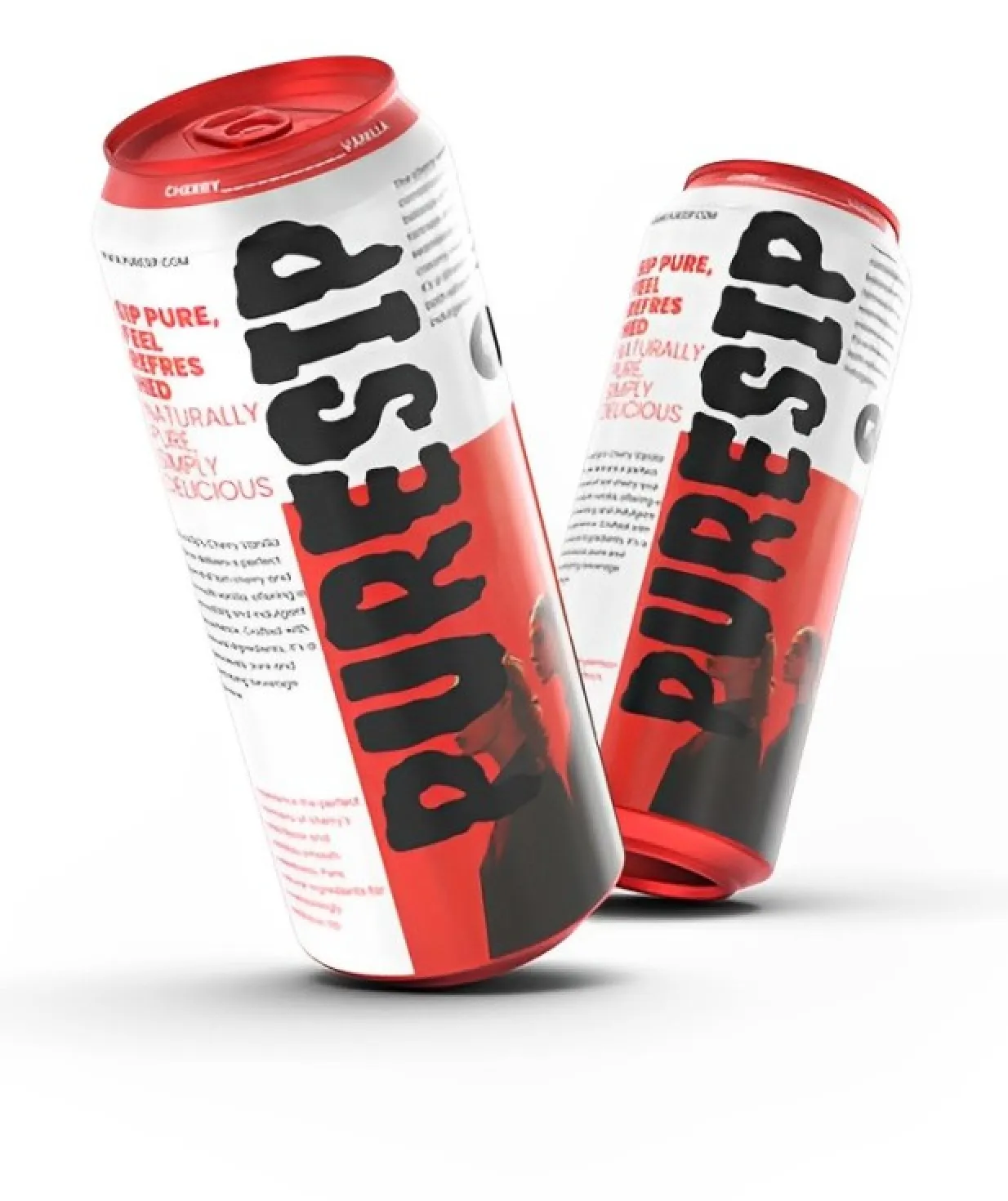
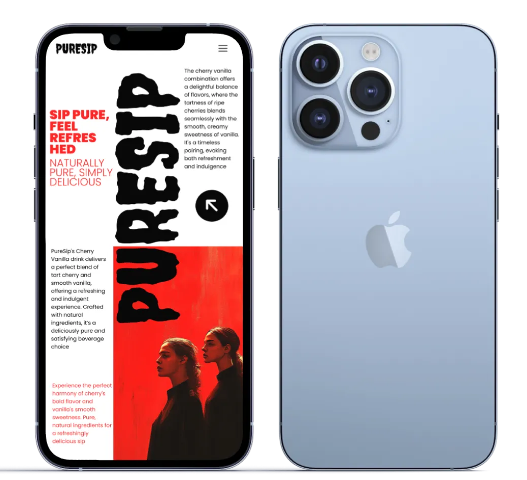
The "PureSip" brand is crafted to evoke a sense of freshness and purity, aligning with the product's promise of pure, refreshing taste. The visual identity combines bold and eye-catching elements to create a strong brand presence. The use of the striking "Creepster Caps" font for the logo and headlines contributes to a dynamic and youthful appeal, while the overall design embraces simplicity to maintain focus on the brand message. The imagery, color palette, and typography work in harmony to create a cohesive and memorable brand experience, appealing to both the eye and the consumer's sense of taste
The brand positioning highlights "PureSip" as the go-to beverage for those seeking refreshment with a bold attitude, making it a standout choice in a crowded marketplace
Typography
The typography for "PureSip" plays a crucial role in defining its brand identity. The primary font used for the logo and headlines is "Creepster Caps," a bold and slightly edgy typeface that commands attention and exudes a youthful, rebellious spirit. This choice reflects the brand's daring and dynamic character. For body text and paragraphs, "Poppins" is used, a clean and modern sans-serif font that balances the design with its simplicity and readability. The combination of these fonts creates a harmonious contrast, ensuring that the brand is both visually striking and accessible to its audience.
Colors
In your PureSip can design, the color palette of #FF2727 (bright red), #FFFFFF (white), and #272727 (black) offers strong visual contrast and immediate impact. The bold red (#FF2727) captures attention, symbolizing energy and passion, while the white (#FFFFFF) conveys purity and simplicity, reflecting the brand's natural and refreshing promise. Black (#272727) adds sophistication and stability, making the branding feel solid and trustworthy. This combination ensures readability, with the dark typography standing out against lighter backgrounds, reinforcing your brand's identity in a clean and powerful way. It embodies boldness, clarity, and modern appeal


