Revolutionizing coffee orders with seamless mobile experience and user-friendly design
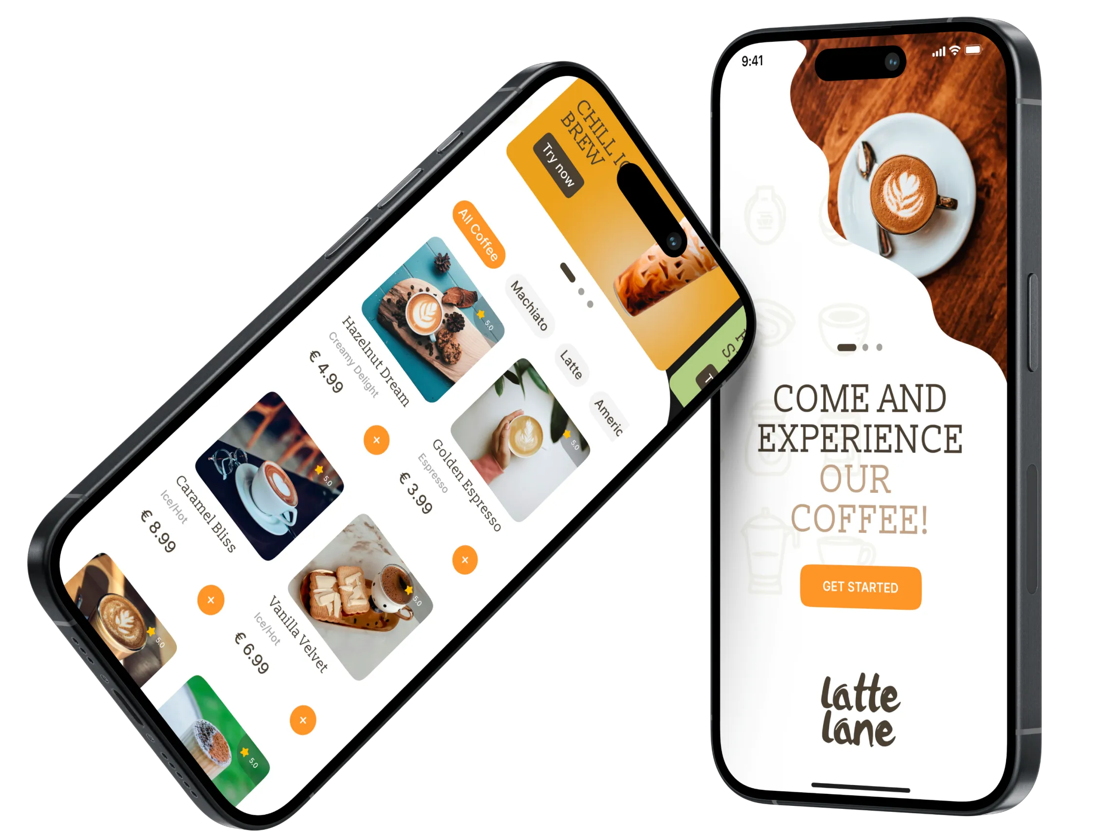

Ordering coffee on the go is often a time-consuming and inconvenient process, especially for busy individuals who need a quick caffeine fix. Current mobile solutions lack personalization, ease of use, and integration with loyalty programs, leading to a fragmented experience that doesn't fully satisfy the needs of the modern coffee consumer
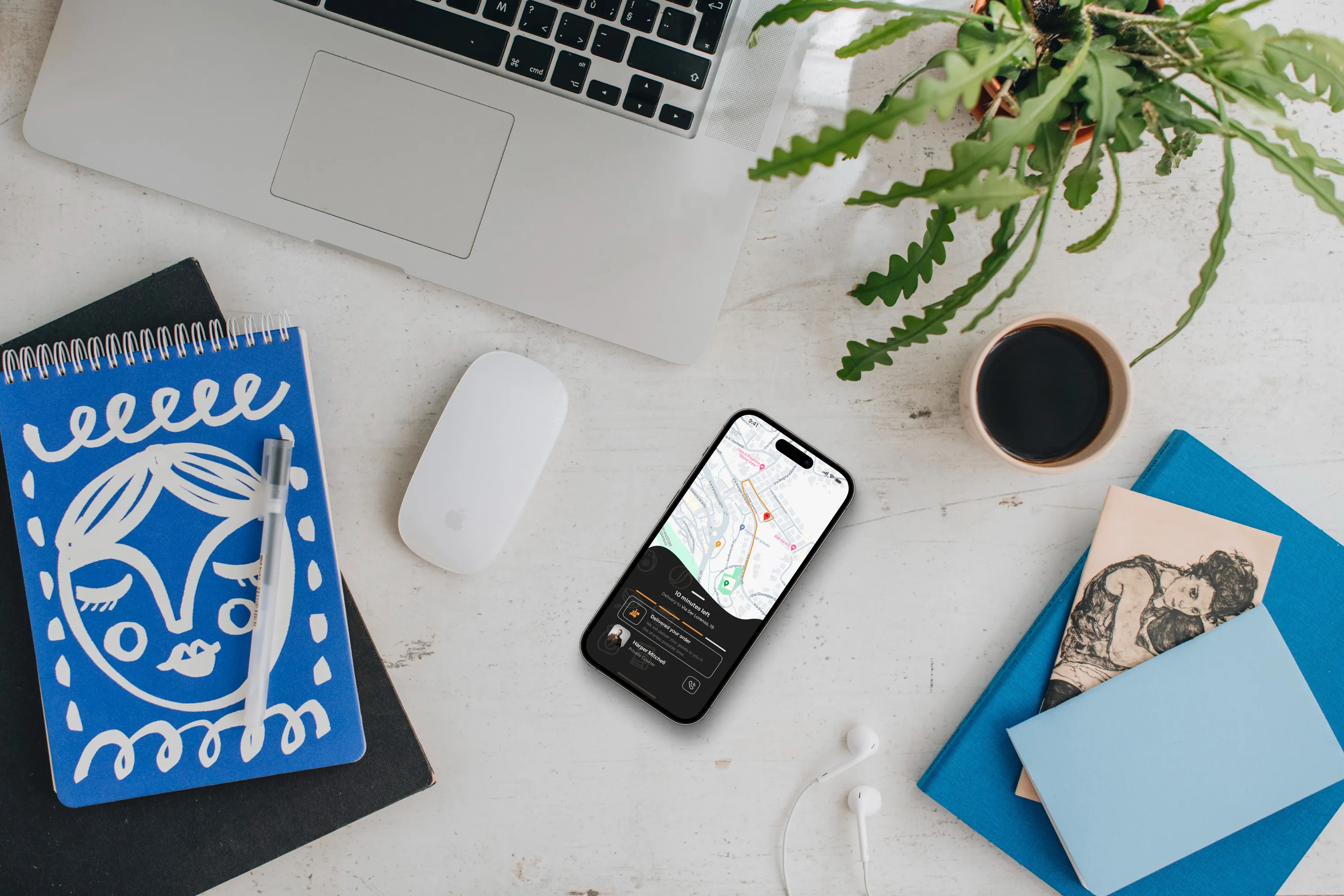
"Latte Lane" is designed to streamline the coffee ordering process with a user-friendly mobile app. It offers customization options, loyalty rewards, and real-time updates on order status. The intuitive interface and seamless user experience reduce friction, making it easier for users to place and pick up their orders efficiently, ensuring they get their perfect cup of coffee without the hassle
Emma is a busy professional who values efficiency, convenience, and high-quality coffee. She uses mobile apps daily and prefers solutions that save her time, especially during her morning commute

28, Marketing Manager
•Quickly order her favorite coffee on the go
•Customize her drink to match her preferences
•Earn and track loyalty rewards effortlessly
•Avoid long wait times by scheduling pickups
•App crashes or slow loading times
•Lack of customization options for her orders
•Not receiving loyalty points for purchases
•A fast and easy ordering process
•Ability to save and reorder favorite drinks
•Real-time updates on order status.
•Secure payment methods integrated into the app
•Push notifications for order readiness.
•GPS integration for locating the nearest coffee shop
•In-app support for quick issue resolution.
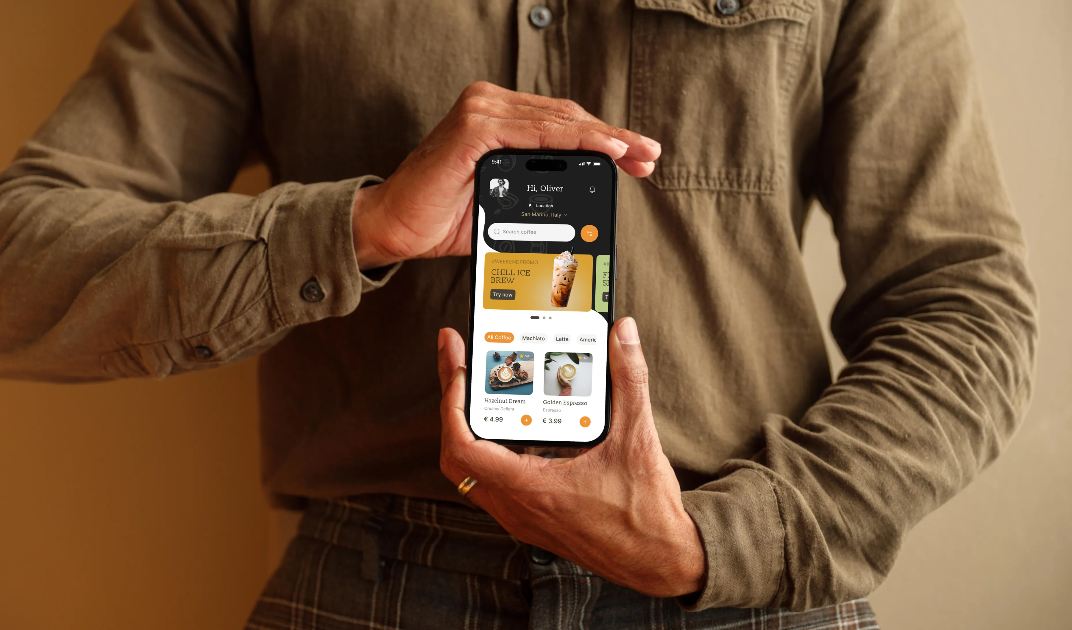
The design process for "Latte Lane" involved three key stages: discovery, design, and product development. During discovery, extensive user research and brand development were conducted to align with user needs and market trends. The design phase focused on creating intuitive UX and visually appealing UI elements that enhance the user experience. Finally, the product development phase involved rigorous interaction design and animation to ensure seamless functionality and engaging user interactions
Defined the brand's identity, focusing on modern, minimalistic aesthetics
Developed a color palette that reflects warmth and sophistication
Created a logo that embodies the essence of a premium coffee experience
Crafted brand guidelines to ensure consistency across all platforms
Conducted user research to understand pain points and preferences
Created wireframes and prototypes to map out the user journey
Tested designs with real users to gather feedback and iterate
Developed a clean and intuitive interface with clear call-to-action buttons
Incorporated visual hierarchy to guide users through the app effortlessly
Used a cohesive color scheme to create a visually appealing experience
Designed smooth transitions between screens to enhance the user experience
Ensured responsive design for optimal performance on various devices
Developed interactive elements that provide instant feedback to users

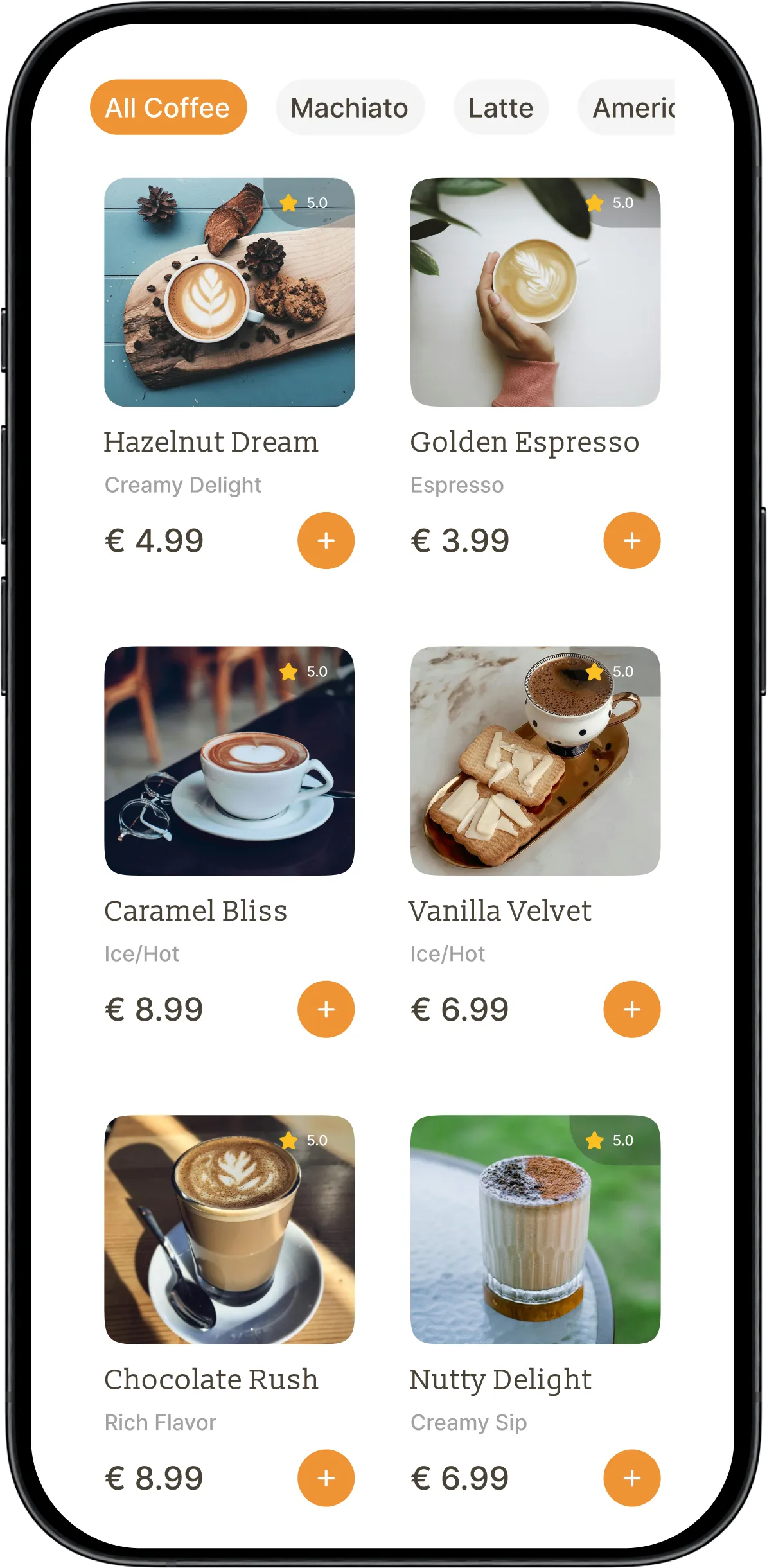
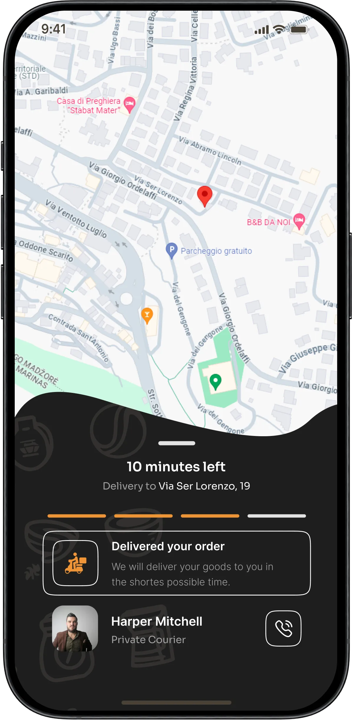
The UX flow of "Latte Lane" is designed to guide users smoothly from opening the app to completing an order. It begins with a simple sign-in or guest option, followed by selecting a coffee shop based on location. Users can then customize their drink, choose a pickup time, and proceed to payment. The architecture ensures each step is clear, intuitive, and optimized for quick navigation
Open app
Sign inn
Select coffee
Drink Customization
Choose time
Payment
Confirmation
Track order
Pick up
Order Coffee Quickly: Simplify the process for users in a hurry
Customize Orders: Provide extensive options for personalized drinks
Track Orders: Offer real-time updates from order placement to pickup
Earn Rewards: Integrate a loyalty program to encourage repeat business
The typography for "Latte Lane" utilizes Slabo 13px for its readable and approachable serif style, ideal for headings and emphasis. Inter font is used for the body text, known for its clean, modern sans-serif design that enhances readability across various screen sizes. This combination creates a balance between classic and contemporary, aligning with the brand’s identity of delivering a premium, user-friendly experience
a
ABCDEFGHIJKL MNOPQURSTUVWXYZ abcdefghijkl mnopqurstuvwxyz 1234567890 ~!@#$%*&*()_+
ABCDEFGHIJKL MNOPQURSTUVWXYZ abcdefghijkl mnopqurstuvwxyz 1234567890 ~!@#$%*&*()_+
The color palette for "Latte Lane" is carefully selected to convey warmth, sophistication, and clarity. The primary color, EF9436, is a warm, inviting hue that evokes comfort and energy. The secondary color, 1E1E1E, is a deep, rich black that adds elegance and contrast. The tertiary color, FFFFFF, is used for clean, crisp backgrounds, ensuring text and UI elements are easily readable
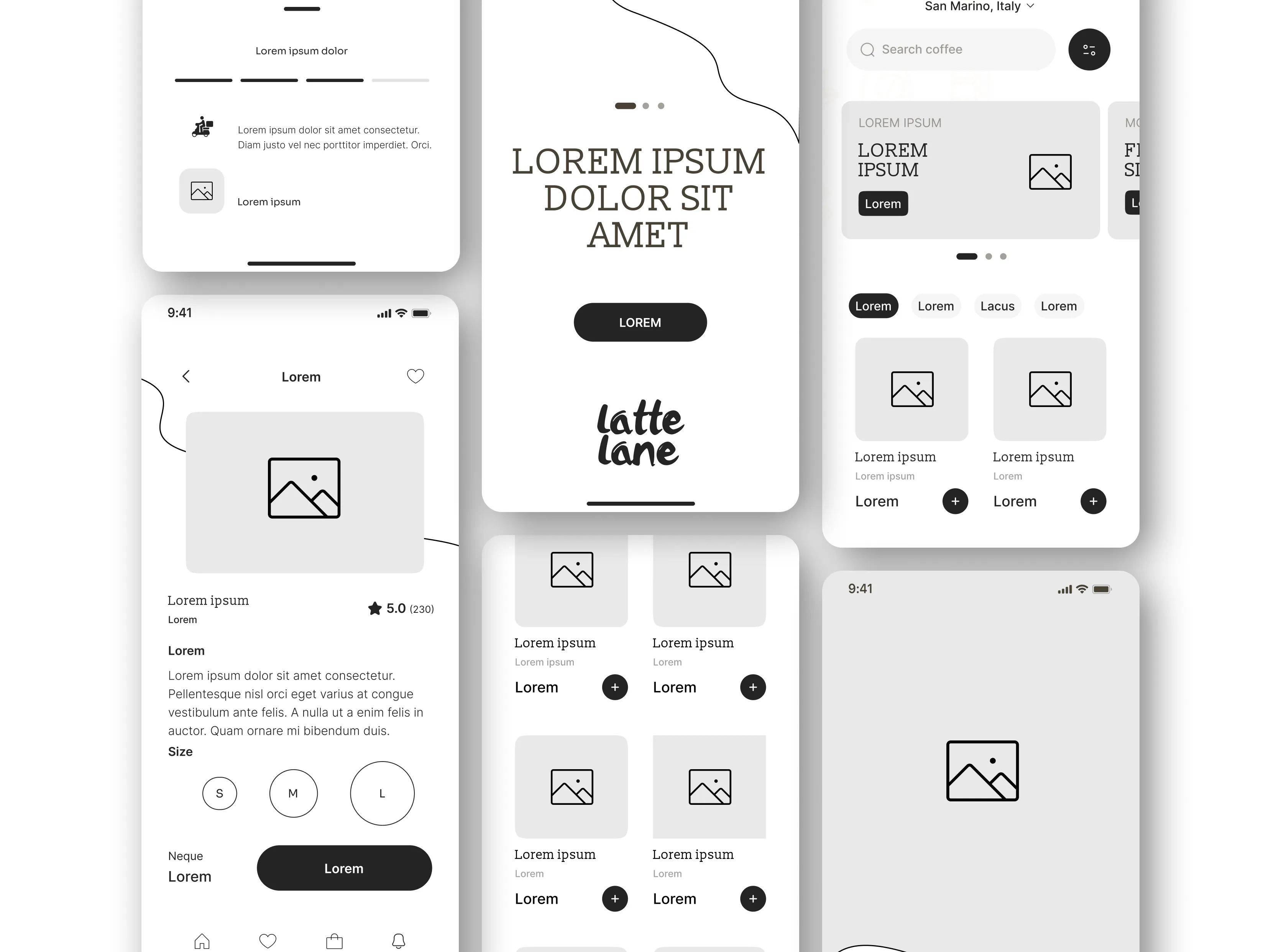
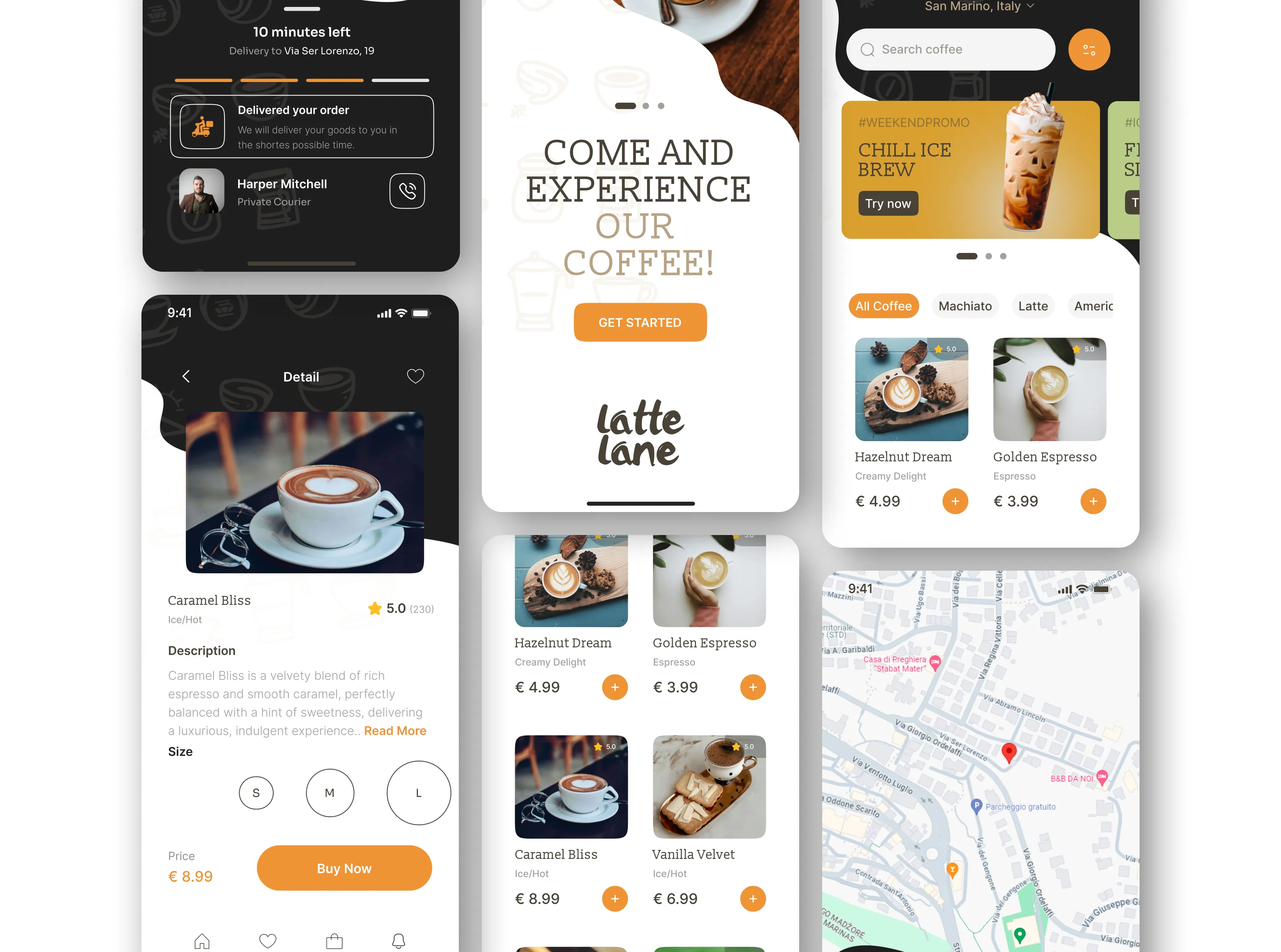
The "Latte Lane" logo is designed to reflect the brand’s modern and approachable personality. It combines a sleek, minimalistic design with elements that evoke the warmth of a coffee experience. The logo is versatile, working well across various mediums, from digital platforms to physical products, ensuring strong brand recognition

Latte Lane" is a mobile app designed to revolutionize the coffee ordering experience. The project focuses on creating a seamless, user-friendly interface that allows users to customize and order their favorite coffee on the go. By integrating real-time updates and a loyalty rewards system, "Latte Lane" ensures that users not only get their coffee quickly but also enjoy a personalized and engaging experience. The design process involved extensive user research, UX/UI design, and product development, resulting in an app that meets the needs of busy, coffee-loving professionals
2024 ©VYPORTFOLIO. All Rights Reserved.