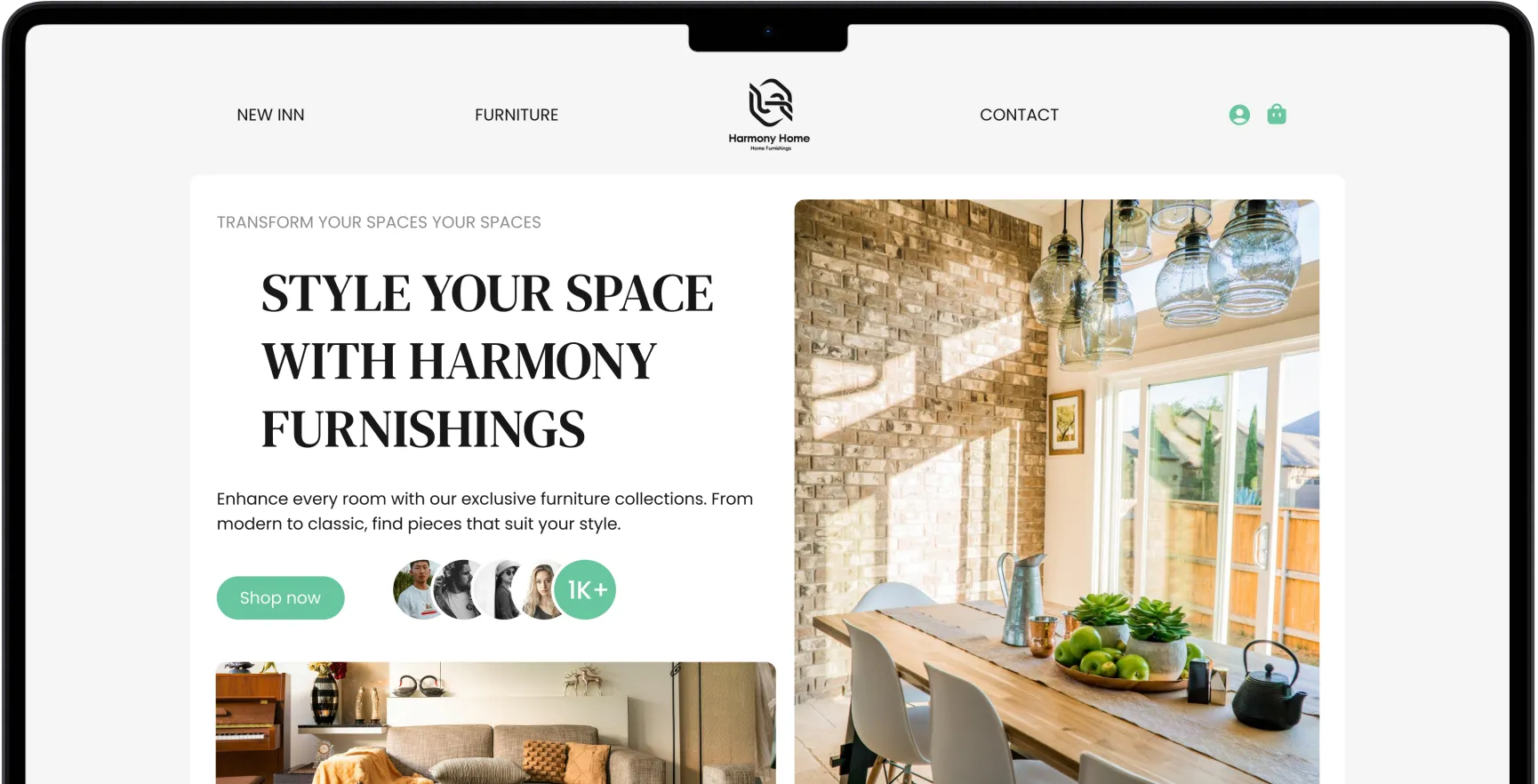


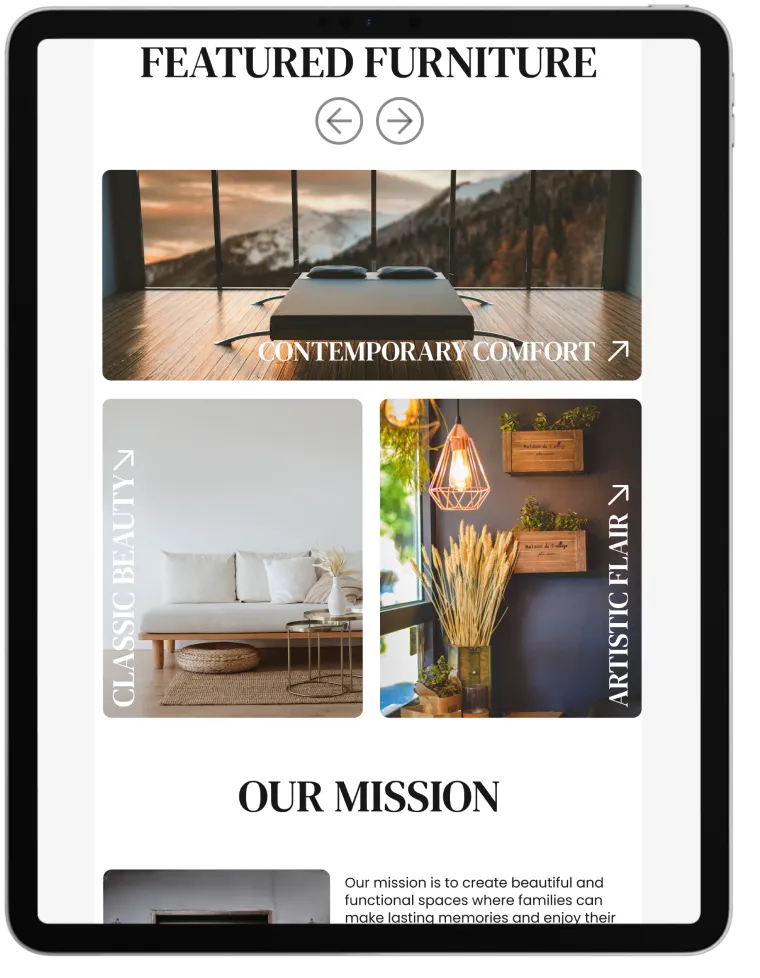
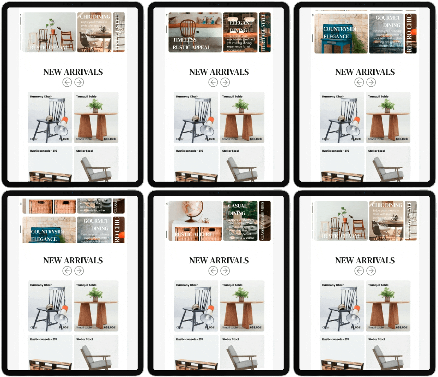
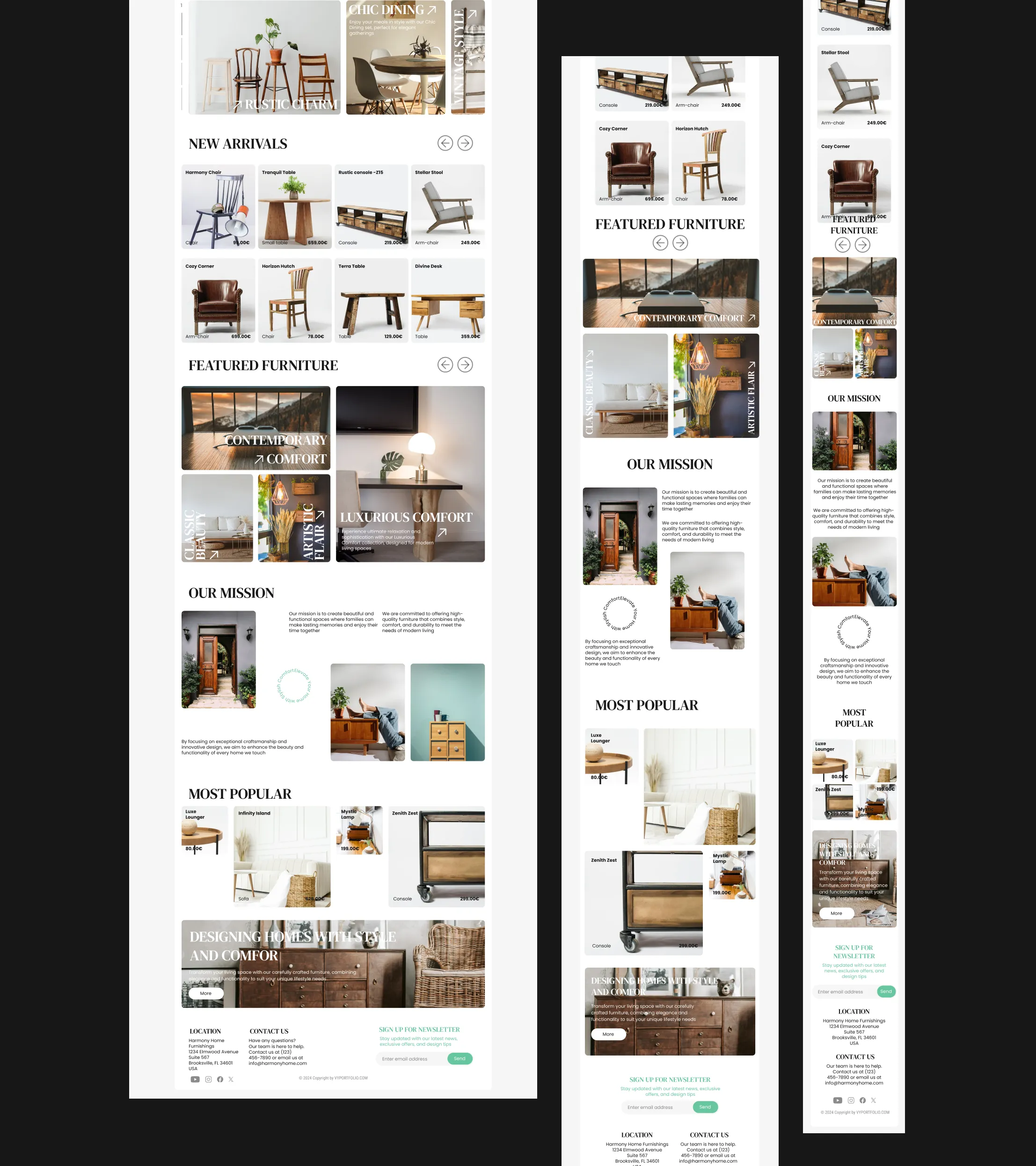
The "Harmony Home Furnishings" website blends visual appeal with functionality, offering an intuitive user experience. Key sections highlight new arrivals, featured furniture, and the company’s mission, ensuring users quickly find what they need while enjoying a seamless browsing journey.
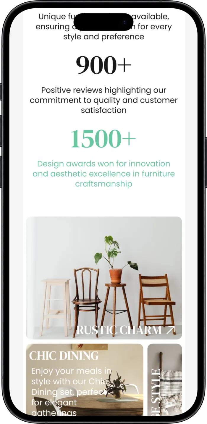
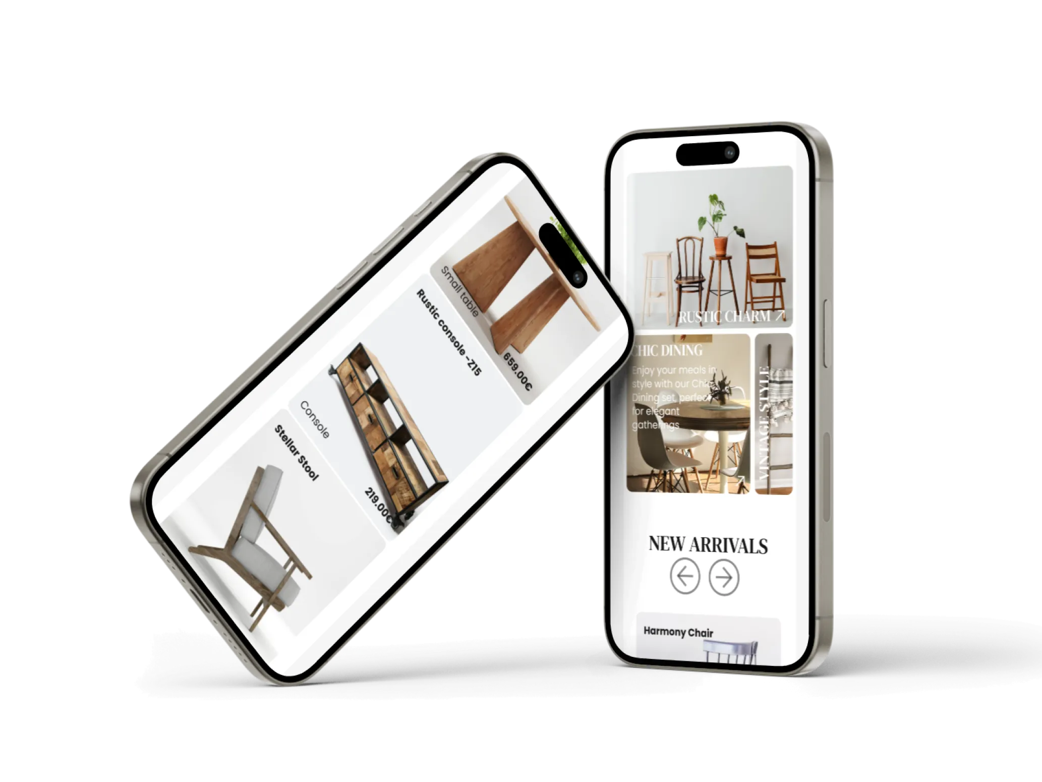
Home Furnishings mobile app prioritizes convenience, offering a streamlined interface for browsing and purchasing on-the-go. It adapts to smaller screens without sacrificing user experience, ensuring customers can easily explore products and make purchases from anywhere
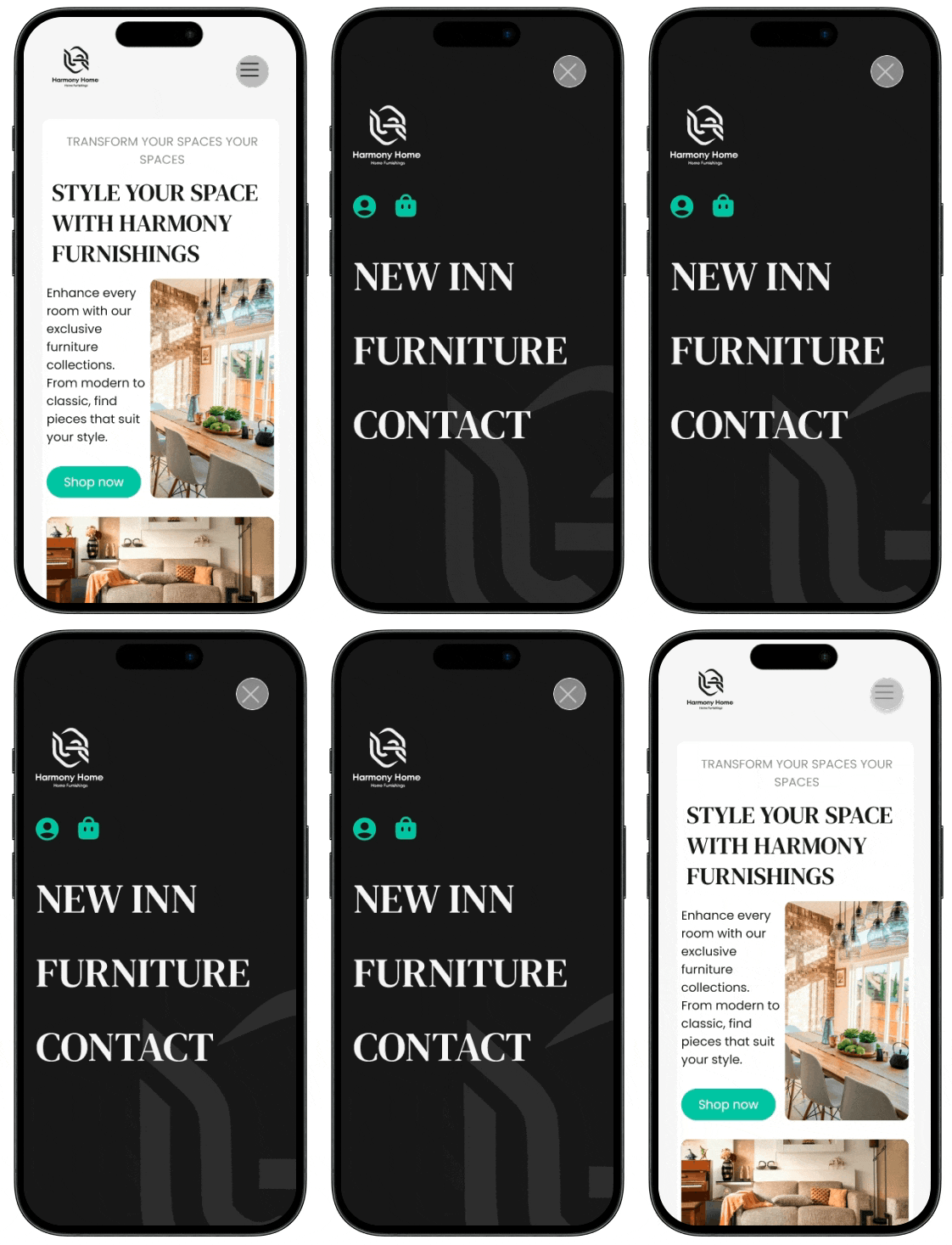
The UI design emphasizes clarity and ease of use, with well-structured layouts and consistent typography. Key elements like featured products and promotional banners are strategically placed to guide the user, enhancing both engagement and conversion rates

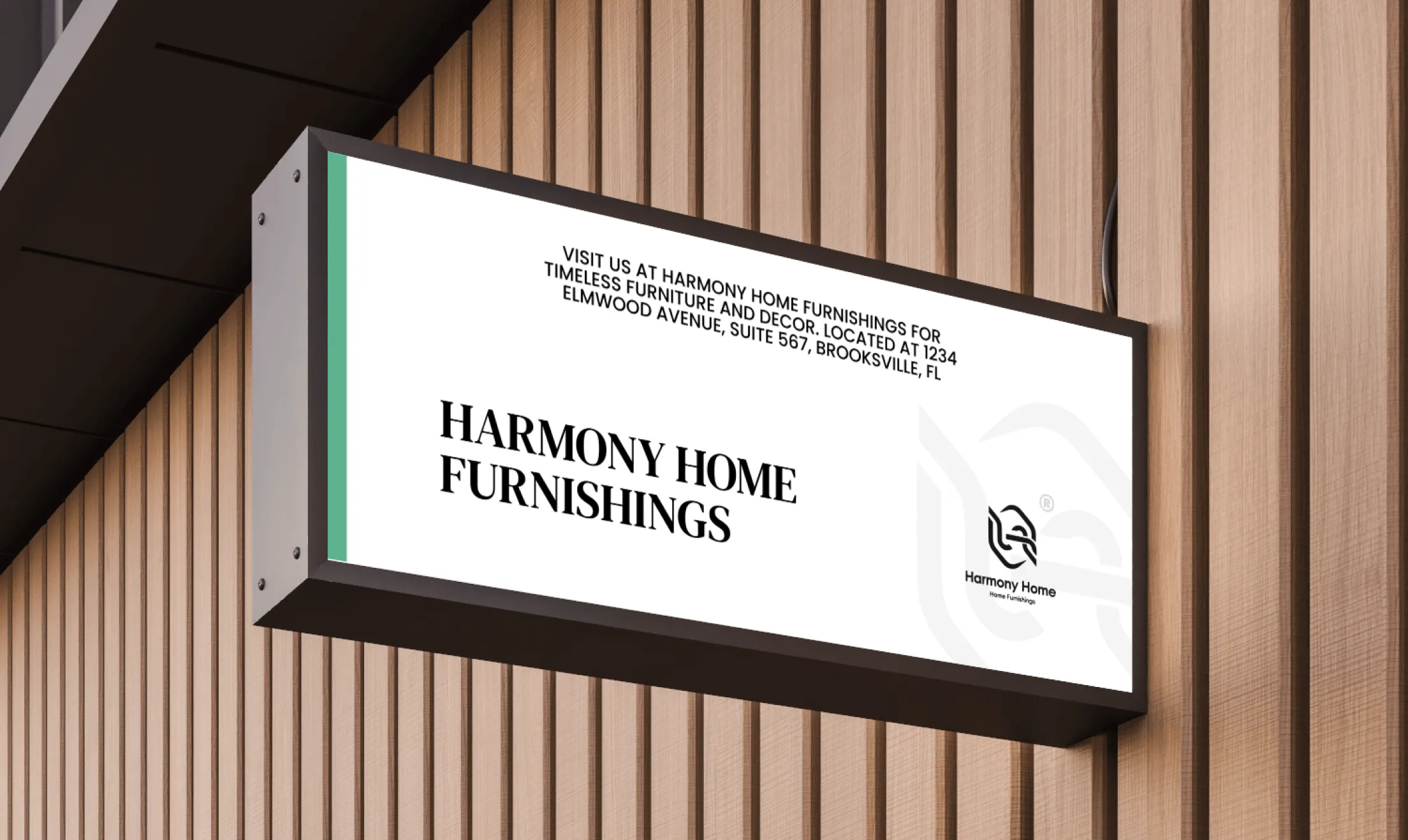
The design is clean and modern, prioritizing user engagement with a balanced layout, intuitive navigation, and visually appealing imagery that enhances the browsing experience.
Users need a visually engaging and easy-to-navigate platform that helps them effortlessly find, explore, and purchase furniture products across different device screens
The website delivers a user-friendly interface with a responsive design, ensuring seamless navigation, clear product presentation, and easy access to essential information on any device
Warm
#D9D9D9

Elegance
#171717

Calm
#67C69E

Minimal
#FFFFFF


Poppins for its clean, modern look that ensures readability across the site, ideal for conveying a contemporary vibe. DM Serif Text was selected to add a touch of elegance, perfectly complementing the rustic charm and refined styles of the furniture showcased
font-family: 'Poppins'
font-family: 'DM Serif Text'
ABCDEFGHIJKL MNOPQURSTUVWXYZ abcdefghijkl mnopqurstuvwxyz 1234567890 ~!@#$%*&*()_+
Light
Medium
Regular
Bold
ABCDEFGHIJKL MNOPQURSTUVWXYZ abcdefghijkl mnopqurstuvwxyz 1234567890 ~!@#$%*&*()_+
Regular

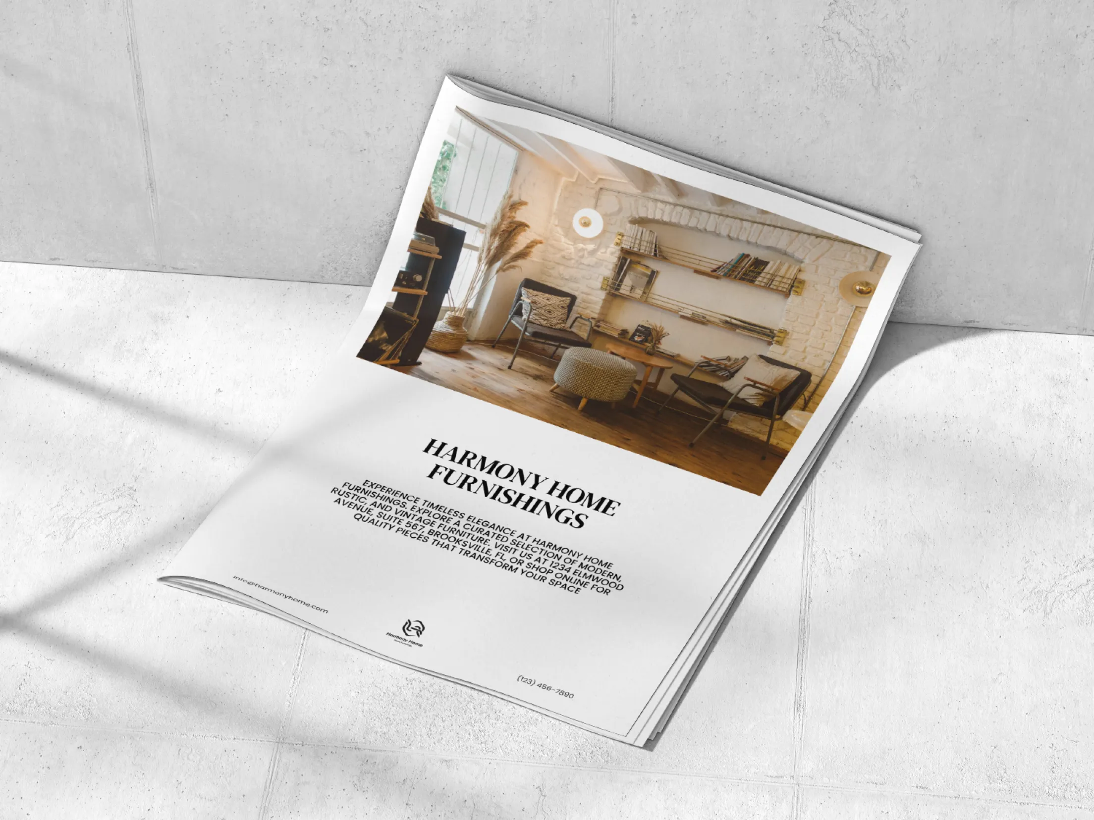


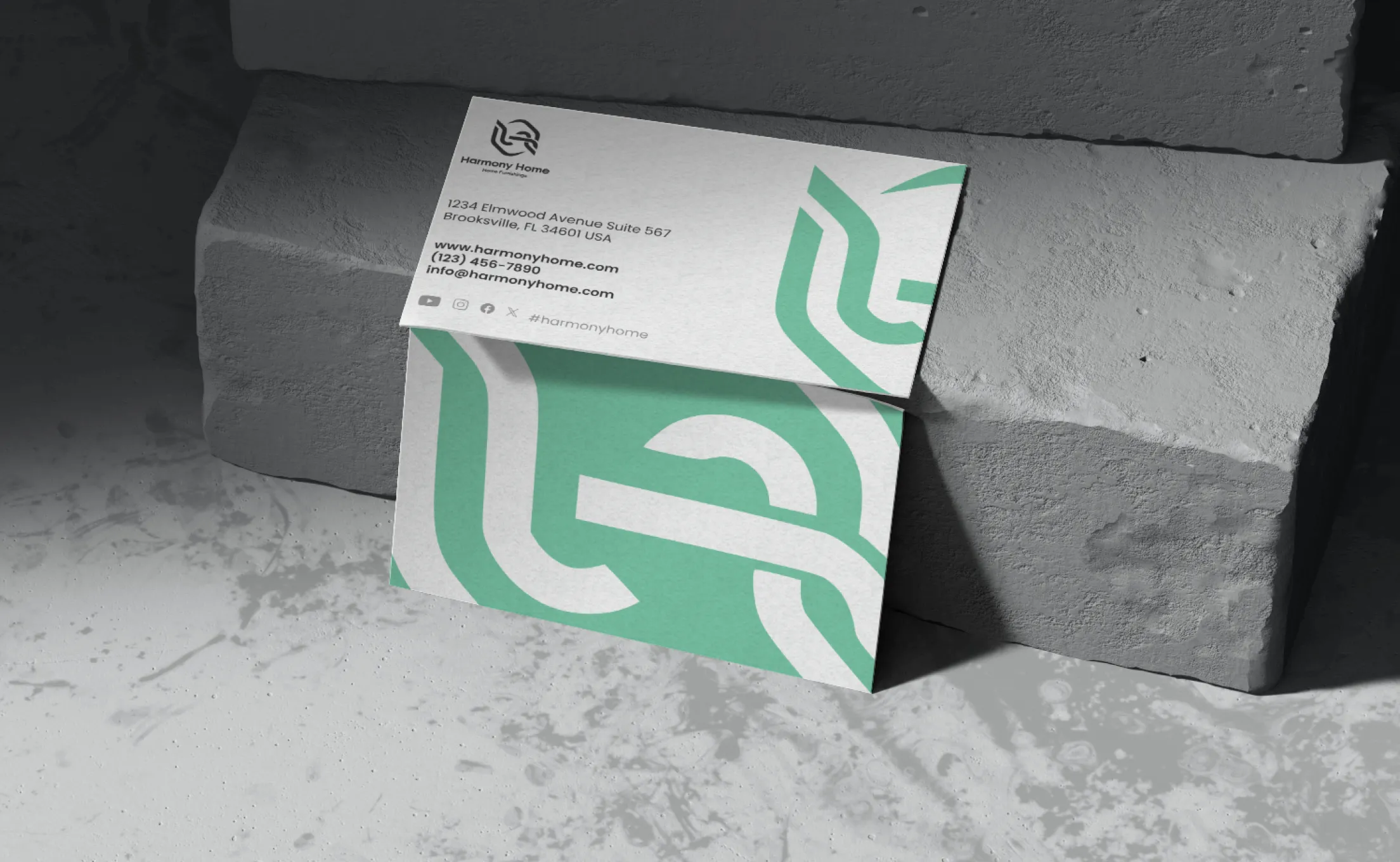
The branding materials for Harmony Home Furnishings effectively convey a cohesive visual identity, combining modern aesthetics with functional design. The clean, minimalist layout of the flyer emphasizes clarity and elegance, making it easy for users to engage with the content. The packaging elements, like custom tape and envelopes, reinforce brand recognition through consistent typography and color schemes. These design choices create a unified experience across physical and digital touchpoints, enhancing both brand appeal and user interaction, and leaving a lasting impression

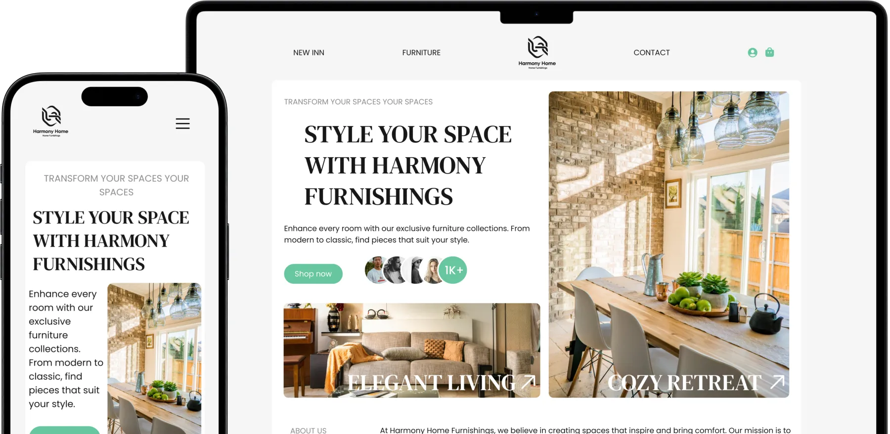
This project focused on creating a user-centered website for Harmony Home Furnishings. By closely aligning with the client’s vision, I developed a design that balances modern aesthetics with functionality. The website's intuitive navigation and cohesive visual elements ensure a seamless experience, meeting both user needs and the client's objectives
2024 ©VYPORTFOLIO. All Rights Reserved.