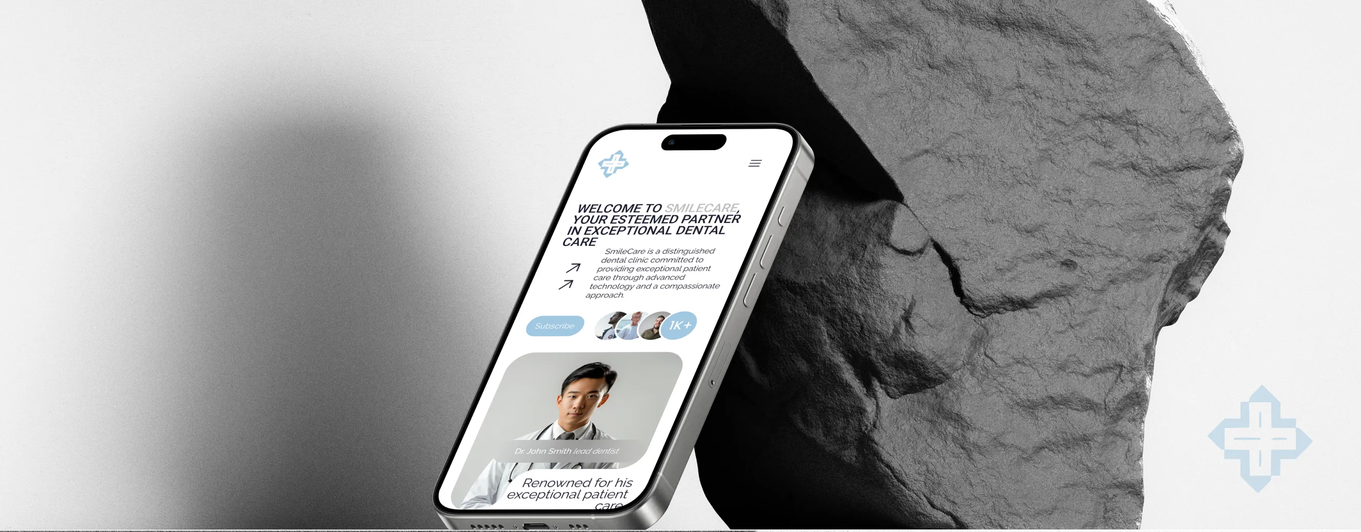

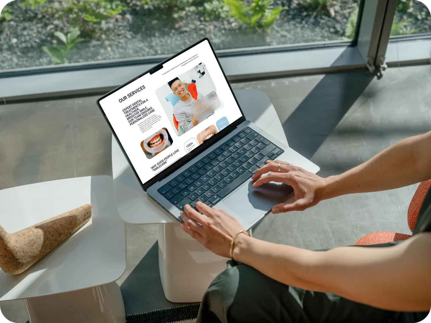
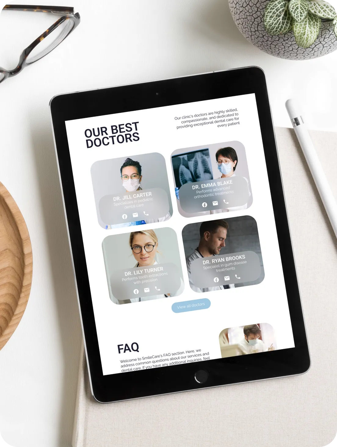
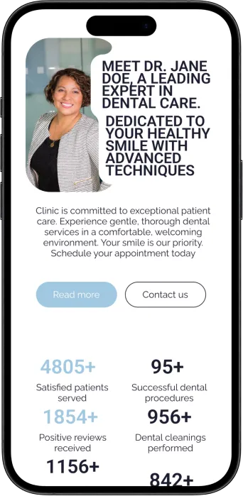
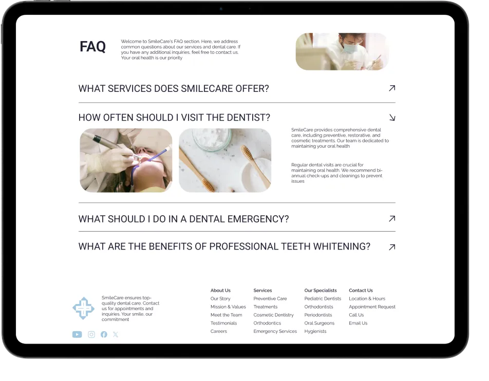
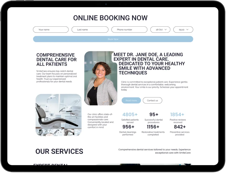
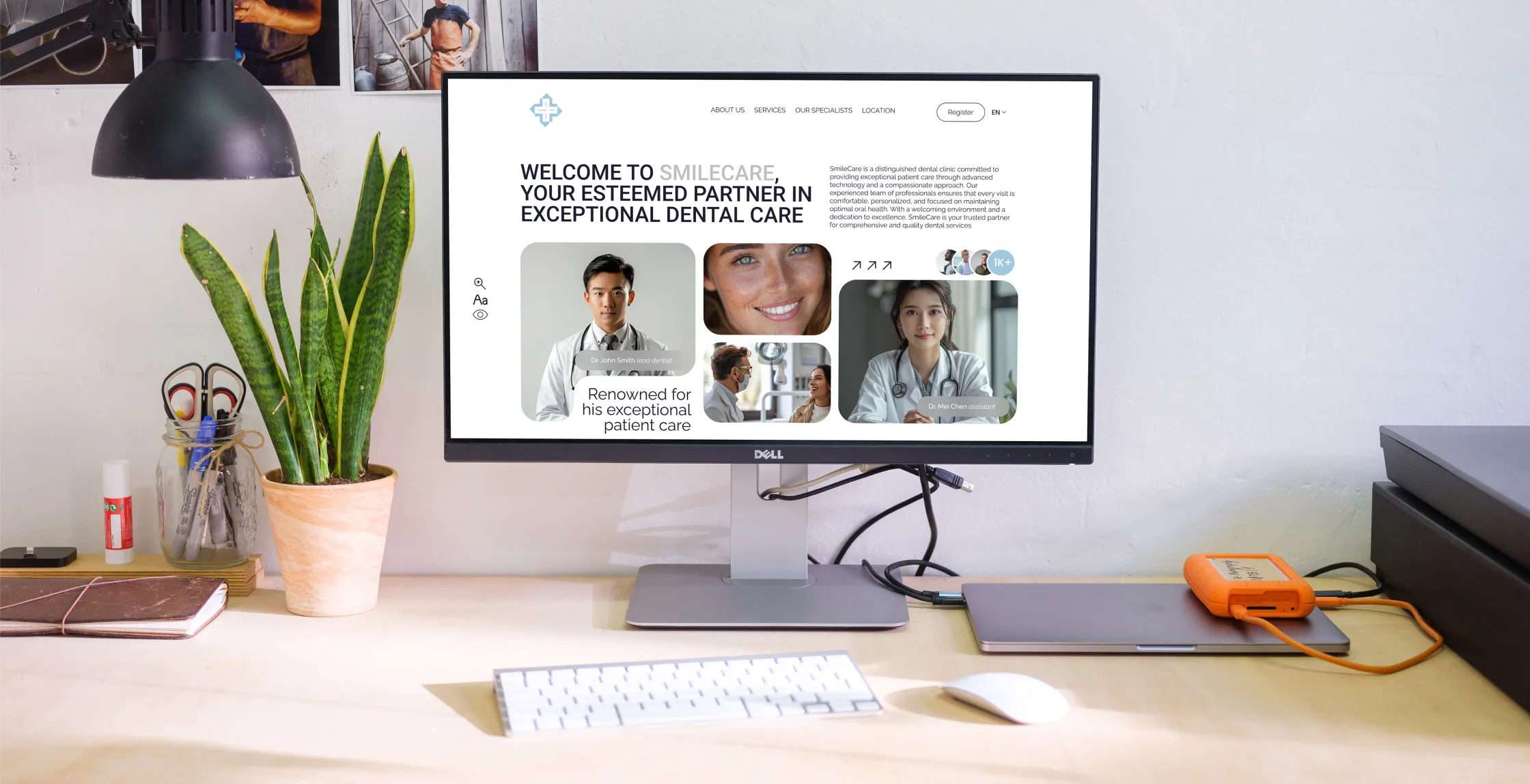
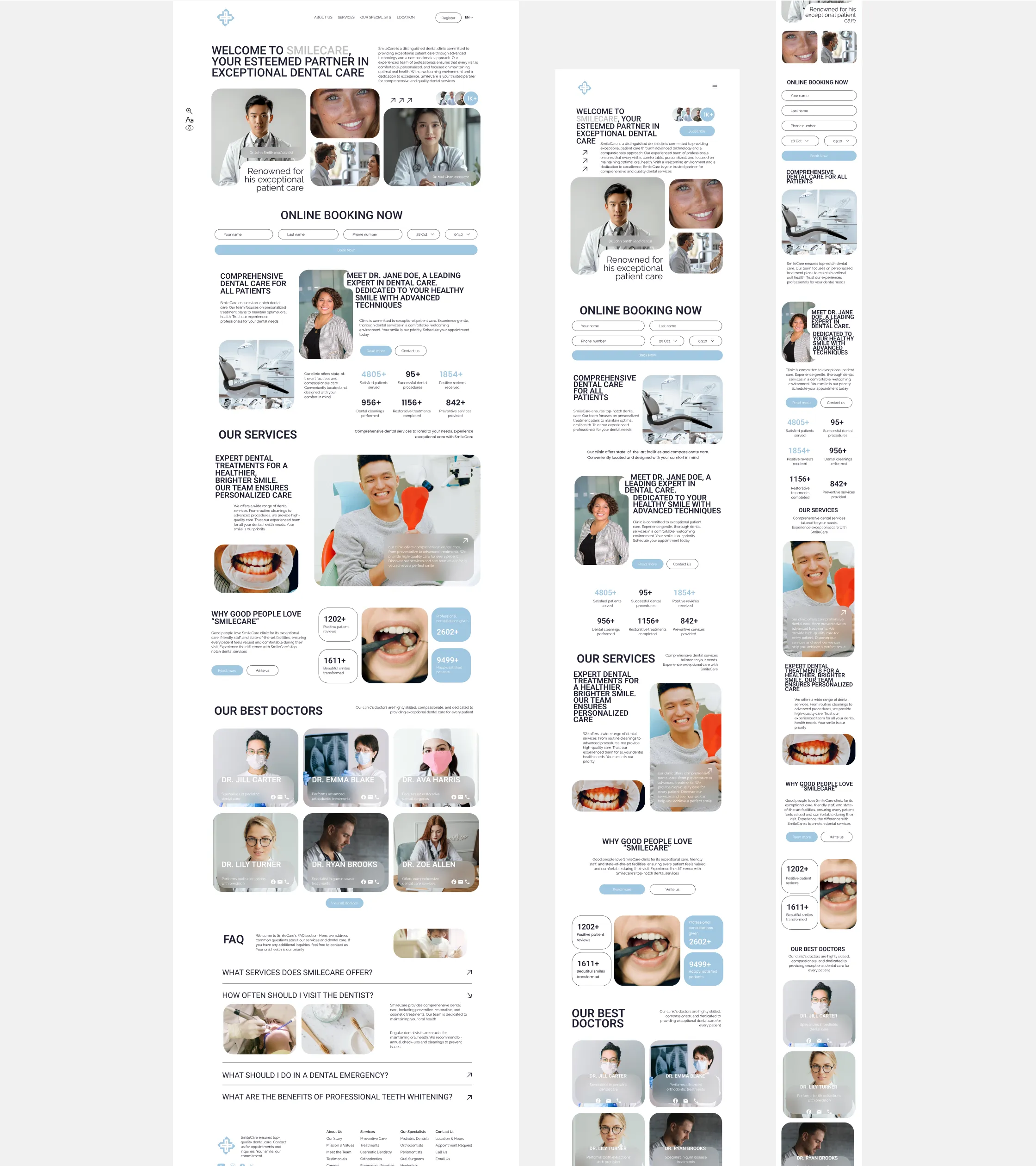
The "SmileCare" dental clinic website is designed to provide a seamless and engaging experience for users, combining modern aesthetics with functionality. The project aimed to create a welcoming and accessible platform that reflects the clinic's commitment to quality care. From intuitive navigation to a clean layout, every aspect of the site was crafted with both patients and usability in mind
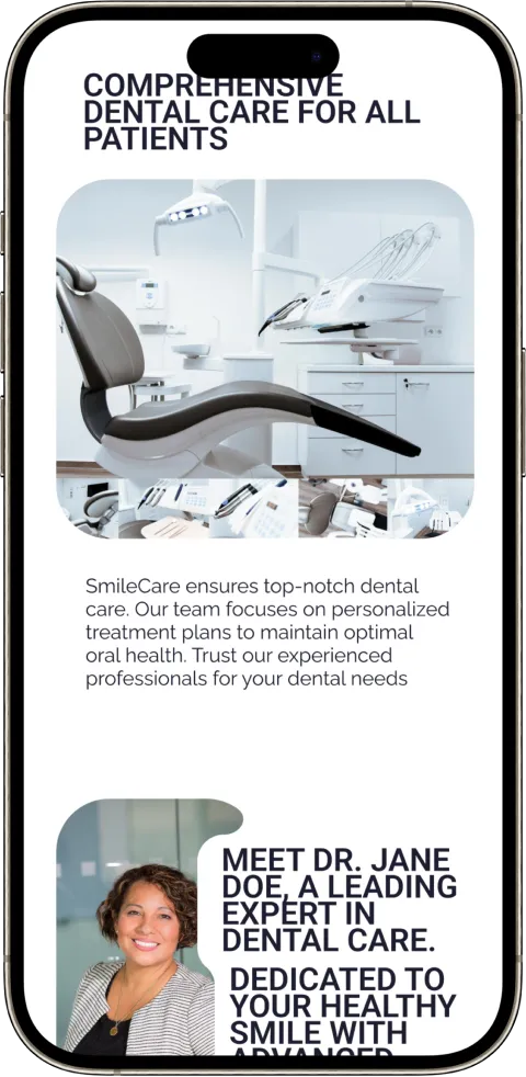
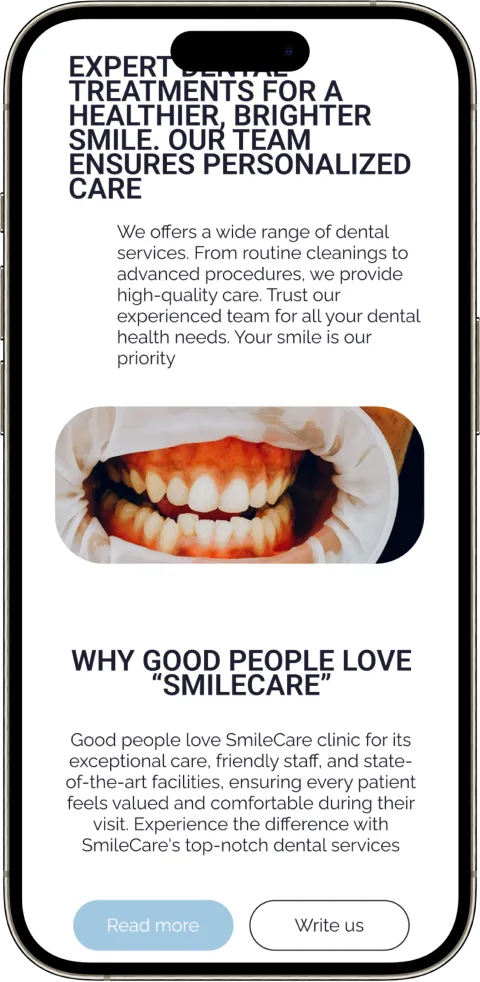
Usability testing was conducted with a diverse group of users to ensure the website's design met the needs of all demographics, including elderly patients. Feedback focused on navigation ease, clarity of information, and overall user satisfaction. Adjustments were made based on this feedback, including improving button accessibility, refining content layout, and ensuring that all interactive elements were easily recognizable.
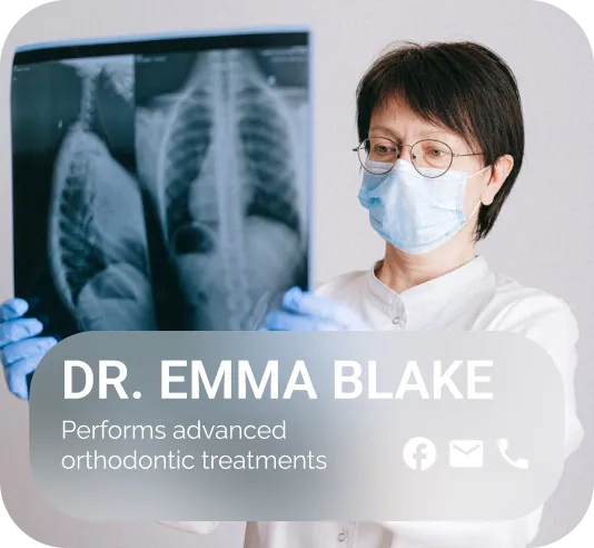
The website was built with accessibility in mind, offering features like adjustable font sizes, color contrast settings, and zoom capabilities for better readability. These options ensure that users with visual impairments or other disabilities can navigate the site comfortably, aligning with the clinic's commitment to inclusivity and patient-centered care.
The combination of "Roboto" for headings (h1, h2, h3) and "Raleway" for body text (p) creates a balanced and modern aesthetic. "Roboto" provides clarity and professionalism in larger text, while "Raleway" offers a clean and approachable feel for reading. Together, they enhance readability and maintain a cohesive visual identity across the site
Font-family: 'Roboto'
ABCDEFGHIJKLMNOPQURSTUVWXYZ abcdefghijklmnopqurstuvwxyz 1234567890~!@#$%*&*()_+
Font-family: 'Raleway'
ABCDEFGHIJKLM NOPQURSTUVWXYZ abcdefghijklm nopqurstuvwxyz 1234567890~!@# $%*&*()_+
Light
Medium
Regular
Bold
WHITE
HEX FFFFFF
RGB 255 255 255
BLACK
HEX 1E1D30
RGB 30 29 48
BLUE
HEX A1C8E1
RGB 161 200 225
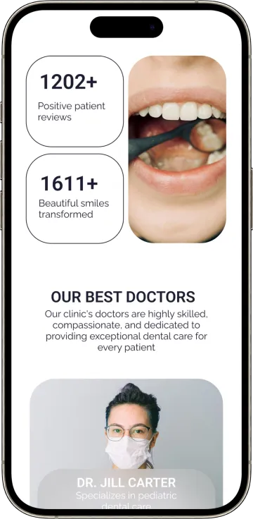
The app design focuses on providing a streamlined user experience, with intuitive navigation and quick access to essential features. The clean interface ensures that users can easily manage appointments, access services, and communicate with the clinic, all from the convenience of their mobile devices
The subscription feature allows patients to stay informed with the latest clinic updates, special offers, and dental health tips. By subscribing to the newsletter, users receive valuable information directly to their inbox, fostering ongoing engagement and building a stronger relationship between the clinic and its patients

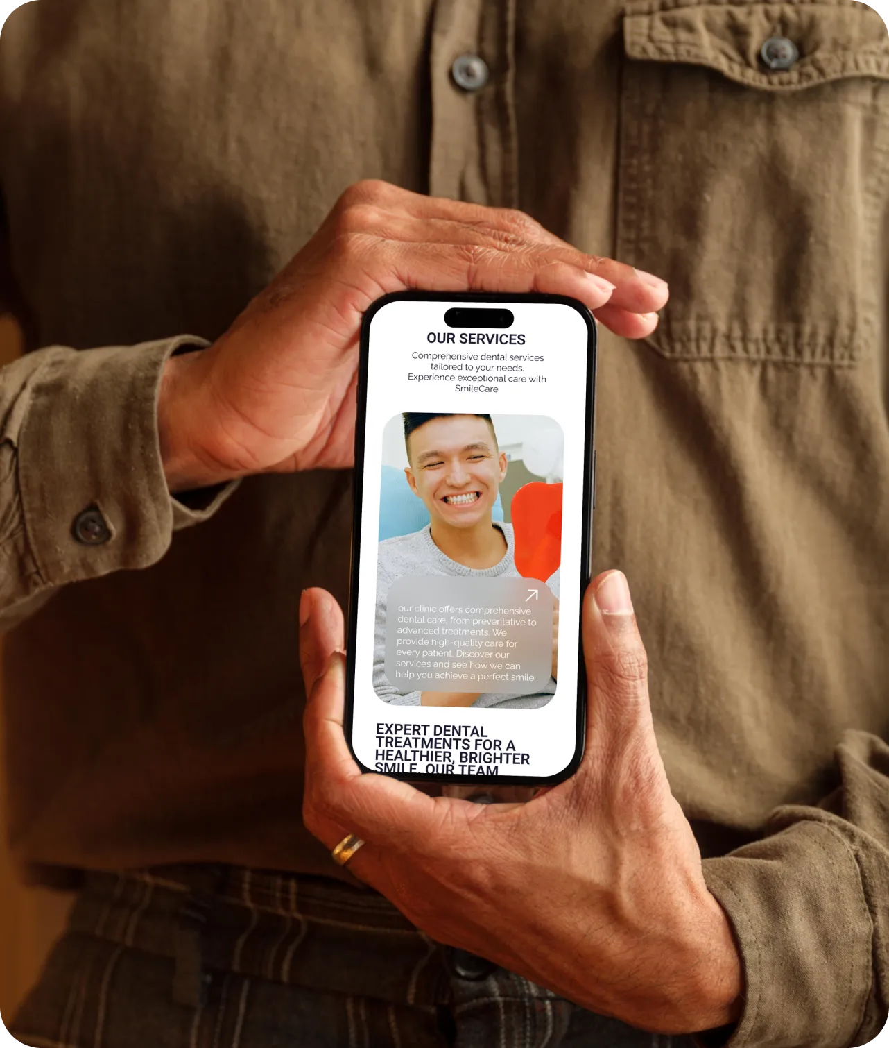
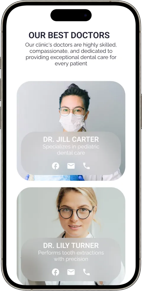
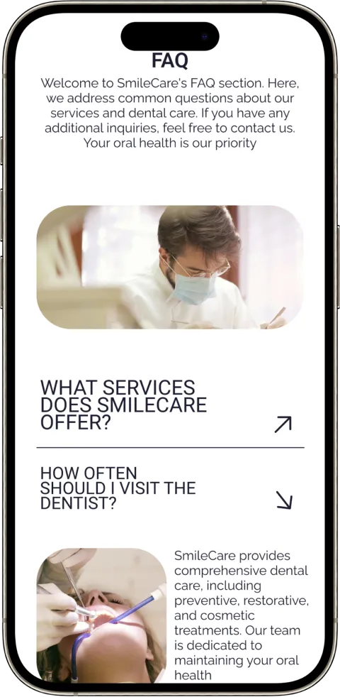
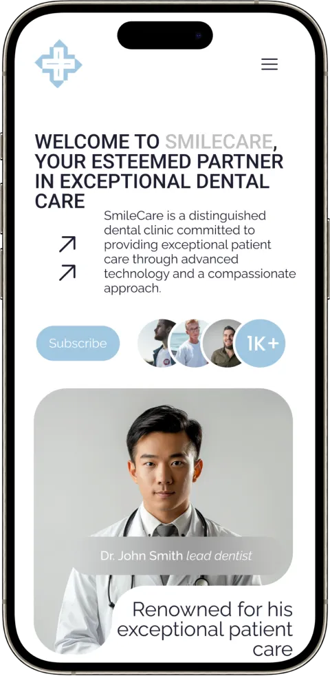
The design of the "SmileCare" website emphasizes simplicity and user engagement. Clean lines, modern typography, and a soothing color palette create a welcoming atmosphere. Every element is strategically placed to enhance usability, ensuring that users can easily find information and access services with minimal effort
Many dental websites suffer from outdated, uninviting designs that are difficult to navigate, especially for elderly users. In contrast, "SmileCare" offers a modern, innovative layout with simple navigation, accessibility features like zoom, color adjustment, and font resizing, ensuring a user-friendly experience for all visitors
"SmileCare" addresses the shortcomings found in other dental websites by integrating advanced accessibility features, user-friendly navigation, and a modern, appealing design. These innovations make the site welcoming and easy to use for all patients, ensuring a superior online experience that other clinics' websites often lack
https://www.odontika.com/en/
And
https://www.SmileCare.com
SmileCare focuses on delivering comprehensive, patient-centered dental care with modern technology and accessibility. Odontika specializes in aesthetic dentistry and implants, with an emphasis on high-quality, personalized treatments
SmileCare offers a clean, modern layout with intuitive navigation, enhancing user experience. Odontika features a more traditional layout that, while functional, lacks the same level of user-centric design
SmileCare: Calming colors, engaging visuals, modern typography
Odontika: Clinical colors, minimal visuals, traditional typography
SmileCare prioritizes accessibility and ease of use, while Odontika offers a straightforward but less intuitive experience
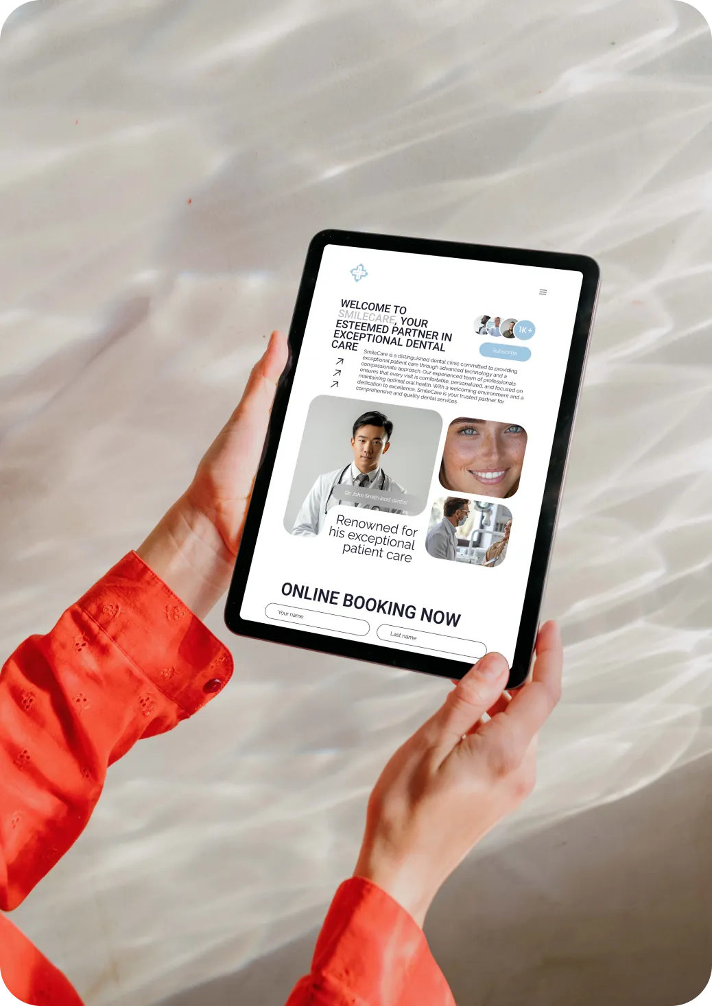
SmileCare: Online booking
Odontika: Service details
SmileCare: responsive design
SmileCare: accessibility options
2024 ©VYPORTFOLIO. All Rights Reserved.