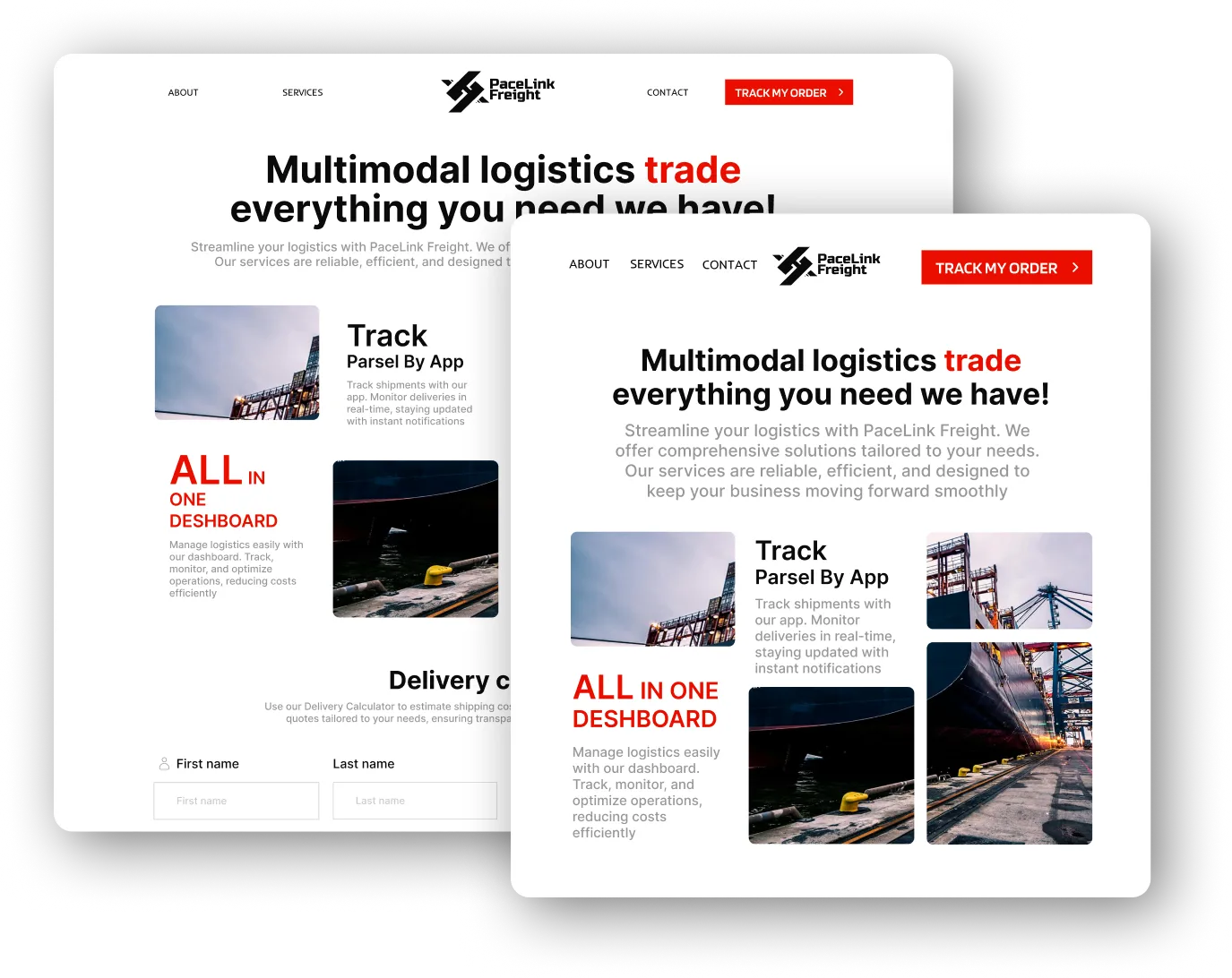
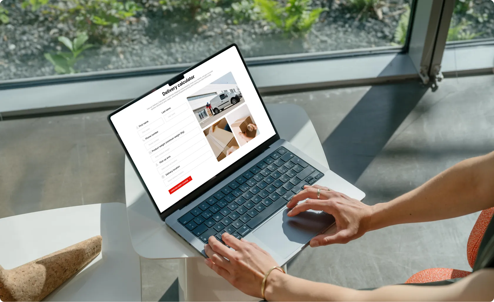
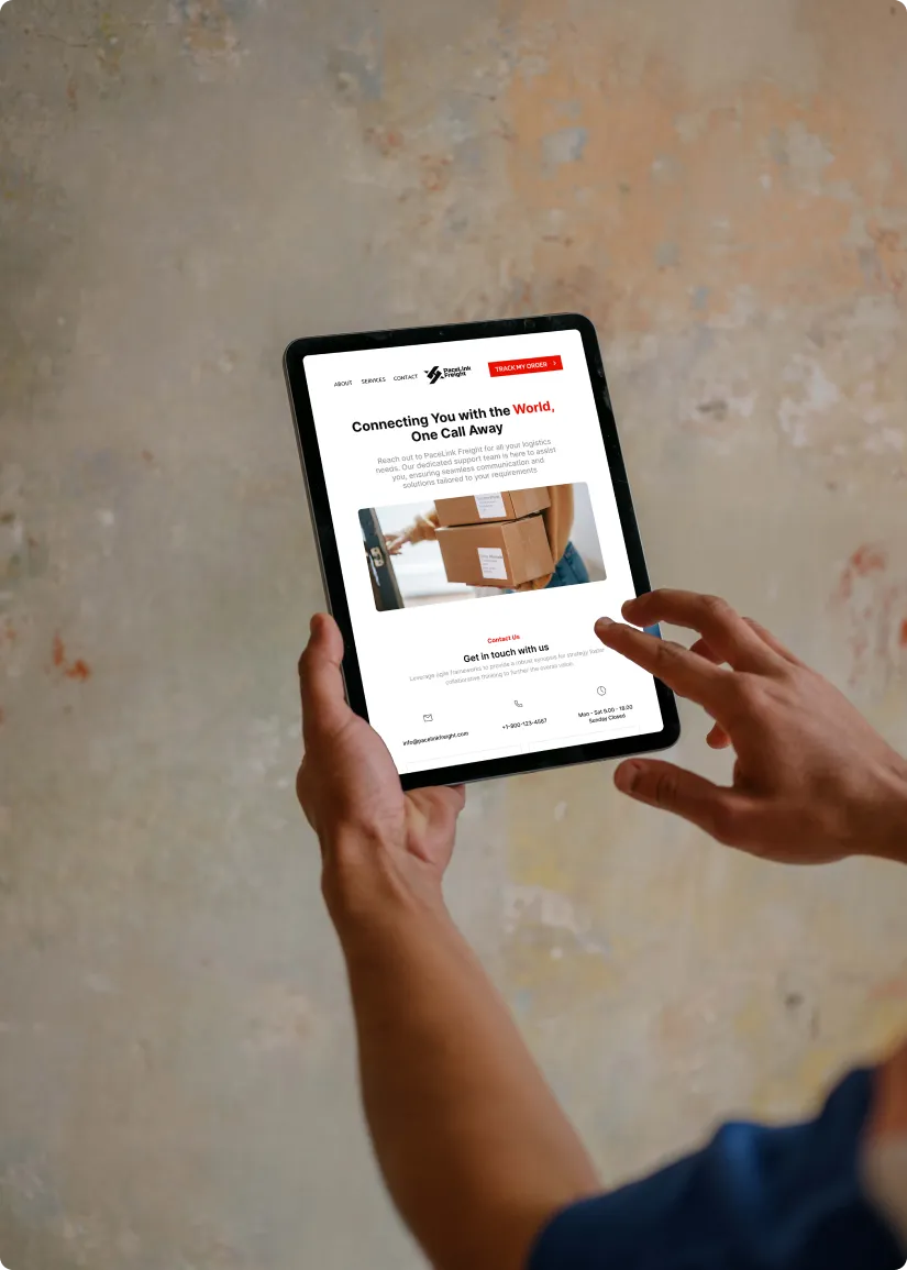
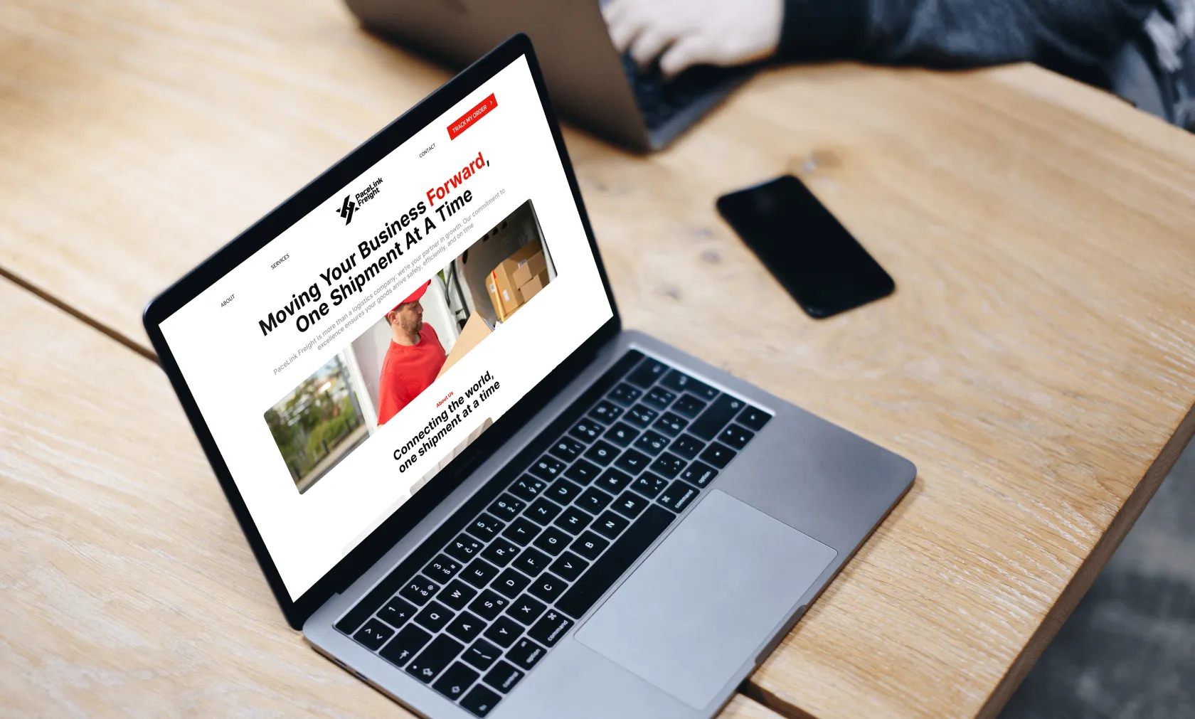
Pacelink Freight is a multimodal logistics service offering tailored solutions for global shipping needs. With an intuitive parcel tracking system and delivery calculator, it provides a seamless experience for individuals and businesses alike.
This website was designed using Figma, ensuring responsiveness across all devices. It features a clean and functional design with a focus on user-centric elements. The UI was designed to be visually appealing and easy to navigate, while the UX focuses on simplifying complex logistics tasks for users
This project showcases the website of Pacelink Freight, a global logistics provider. The goal was to create an informative and professional website that caters to users needing efficient delivery solutions. The design prioritizes clarity, navigation ease, and responsiveness across different devices, ensuring an optimized user experience
The purpose of this project was to develop a user-friendly interface for Pacelink Freight, helping their customers manage logistics efficiently. It was designed to simplify the logistics process for users by offering clear information and intuitive tools like a delivery calculator, enabling quick decision-making for shipments
The mission of Pacelink Freight’s website is to provide a seamless and efficient user experience for global logistics management. The website is built to serve both businesses and individual customers by offering easy access to tracking tools, clear information, and a fast response system for delivery-related needs
Pacelink Freight envisions becoming a leader in the logistics industry by offering a user-centered digital platform that simplifies logistics management. The website was built to enhance customer engagement by providing a frictionless online experience, empowering users to manage their logistics needs with ease and confidence
Font-Family: 'Inter'
ABCDEFGHIJKLMNOPQURSTUVWXYZ abcdefghijklmnopqurstuvwxyz 1234567890~!@#$%*&*()_+
Light
Regular
Medium
Bold
HEX #EA0E00
HEX #0B0B0B
HEX #FFFFFF
The navigation is intuitive, with a fixed menu at the top, making it easy for users to locate key sections like services, contact, and parcel tracking. The mobile menu is collapsible, ensuring responsiveness.
The website’s interaction design includes smooth hover effects, clickable elements, and a simple form submission flow, contributing to an engaging and user-friendly experience.
The website was designed with accessibility in mind, using readable fonts, high-contrast colors, and accessible form labels. It ensures that all users, regardless of their abilities, can navigate and interact with the content seamlessly.
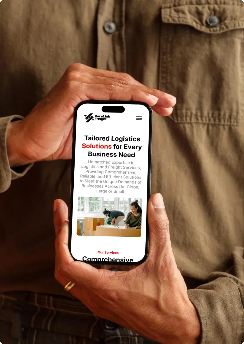
The website is fully optimized for mobile devices, ensuring a seamless experience across all screen sizes. Its responsive design adapts content, images, and navigation elements for easy interaction on smartphones and tablets
Users will find the site easy to navigate, visually appealing, and functional. The combination of intuitive tools, clear information, and responsive design ensures a high level of user satisfaction, whether on desktop or mobile devices.
Made with
2024 ©VYPORTFOLIO. All Rights Reserved.